HKChat Design System
A design system that gives design and engineering one shared vocabulary, so HKChat stays consistent as it keeps adding features.

My Role
I owned the design system while the product kept shipping.
01.
System ownership
Tokens, components, documentation, and the loop back from code.
02.
Design-to-code handoff
The export pipeline and the checks that keep design and code aligned.
03.
Feature design
News, community, weather preview, and the widget rules underneath them.
Challenges
Features were shipping faster than the design language could hold them.
01.
No tokens
Components were built without defined values. Nothing to point at when two screens disagreed.
02.
Inconsistency became a UX problem
The same control behaved differently depending on the screen. Not only a visual issue.
03.
Two jobs at once
Features kept shipping. The system had to be built around a product that would not pause.
About the product
HKChat is Hong Kong's first locally built AI assistant.
Hong Kong's generative AI research centre, funded under InnoHK and led by HKUST. It runs five domain products and is now moving from research into commercial operation. As their MVP product, HKChat launched November 2025. Reached #1 on the Hong Kong App Store and 90,000+ users in its first week. Runs on HKGAI V1, a locally fine-tuned model. Answers in Cantonese, Traditional Chinese, Simplified Chinese and English.

Goal
Architecting a Design System for AI-Assisted Workflows
The design system runs on a shared context layer that connects the Figma library and the codebase, with both sides resolving to the same tokens so a single change propagates everywhere without rewrites. AI sits inside this loop: it generates the prototype for review and reads the Figma file directly to export the spec and tokens that developers build from.

process
Five stages from audit to production.
Audit
Read the shipped code and figma file to separate real variation from accidental drift.
Components
Build the shared set in Storybook, each one defined with its states and its usage rules.
Tokens
Two tiers of values. Semantic names describe what a value is for, so developers know when to use it.
Handoff
Performance, SEO and analytics are checked, then we go live and keep iterating.
01.
Deep audit
HKChat grew quickly, and the same control could look different from one screen to the next. There was nothing shared to point at, so before designing anything, we read what already existed and gave each decision a name.
02.
Component building
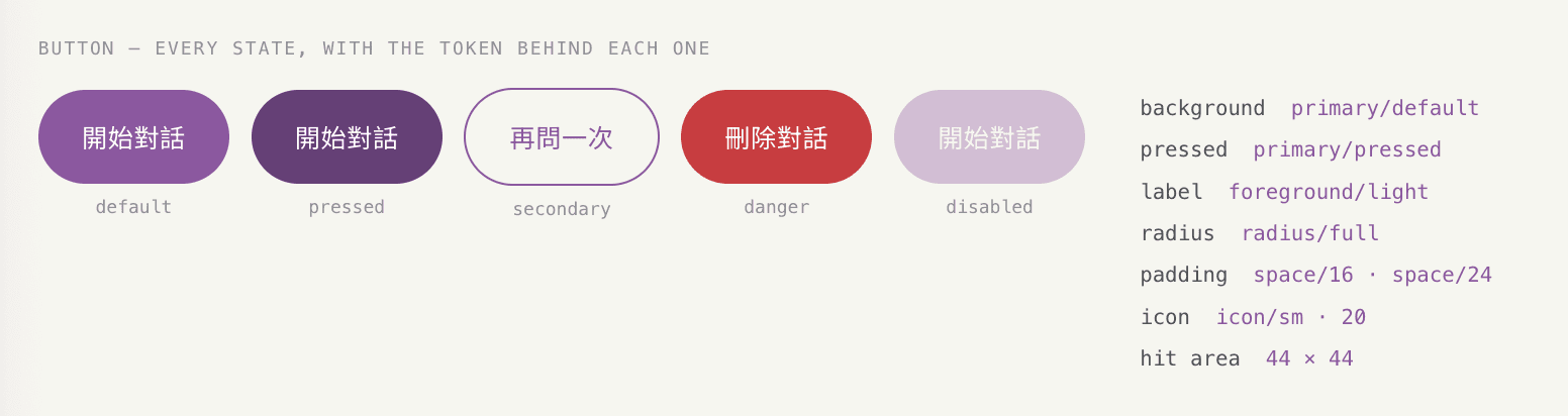
Built the shared set in Storybook, deliberately small at first. Each component defined with its states and its usage rules, including when not to use it.
03.
Token architecture
Two tiers. Primitive values hold the raw scale and nothing in the interface binds to them. Semantic roles describe what a value is for, and only those carry both a light and a dark value.
Naming carries the most weight here. color.primary.default tells a developer where the value belongs and when to use it, so the token can be applied without asking a designer. A name like --user-message-bg describes one spot on one screen — it cannot be reused, and it gets missed when a second theme is added.
04.
Export and validation
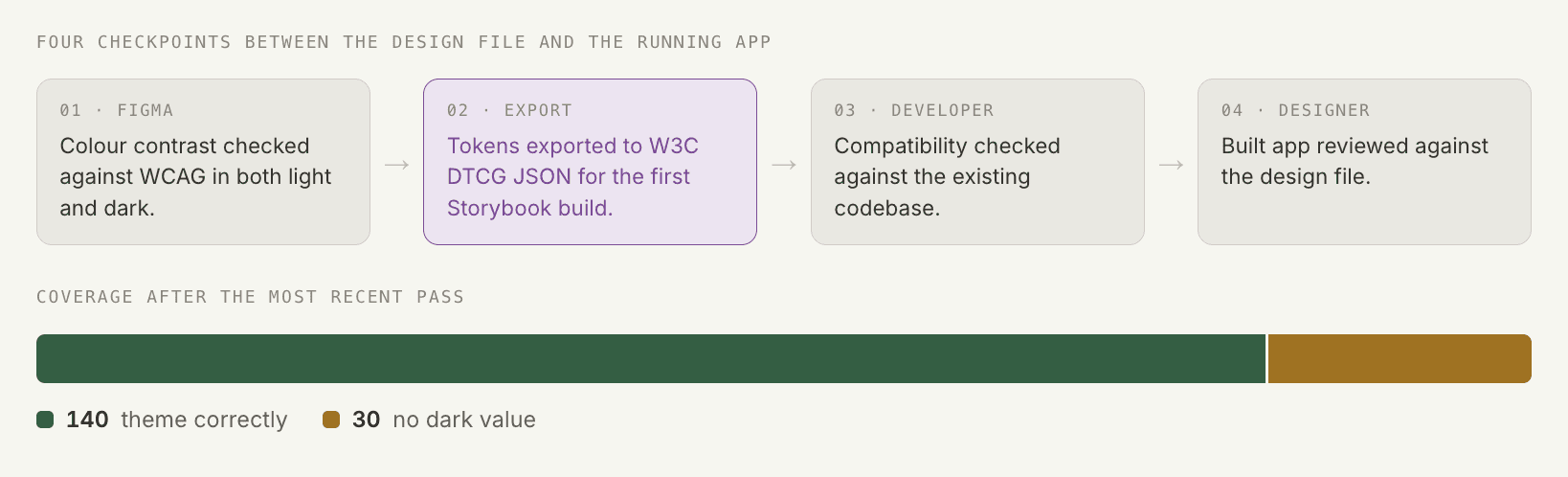
Checking and exporting run as one chain. The contrast check happens in Figma before anything leaves the file, and the last check happens in the built app.A style guide us also published for non-technical stakeholder.
COMPONENTS SHOWCASE
Outcome & Reflection
What I've learned
Format determines what becomes possible later. By structuring the system in an open, AI-readable format from the start, I made it readable by both people and AI—not just editable by hand. That foundation enabled automated audits, scalable updates, and other workflows that would otherwise require manual effort.
What I'll change next time
Define what a better system means before building one. A more efficient system is not automatically a better one. Fewer values to update and faster handoff measure how the system runs, not what it produces. It also has to be judged on accessibility, visual consistency, usability, and brand expression. That needs a baseline — so next time the Figma library gets versioned alongside the code, with a changelog and written evaluation criteria, and improvements become traceable rather than assumed.